Cookware companies are vying for a place in the millennial kitchen with a seemingly universal template of mid-century nostalgia meets sleek futurism. Will it work?
When cookbook author David Lebovitz first laid eyes on Le Creuset’s aeronautical 1960s-era Coquelle at a French flea market in 2005, he fell in love. The pot, with a distinct, the-future-is-here silhouette, was designed by Raymond Loewy, the industrial designer who had worked for Studebaker, NASA, and Pennsylvania Railroad. Loewy’s signature futuristic style is evident in the Coquelle’s swollen rectangle of a lid, and in the handle that recalls a car door. Le Creuset reissued the Coquelle in 2014, but it didn’t quite take off. “I happened to buy ten of them,” Lebovitz says. “I think they were having a sale.”
The fleet of new Coquelles joined the pastry chef’s four vintage ones, and an already expansive collection of Le Creuset pots. “I find the shapes really pleasing,” explains Lebovitz (a self-declared Modernist and Paris flea market addict). “They’re kind of retro, but not caricature retro.”
Some 60 years after Loewy rendered his Coquelle, an emerging crop of direct-to-consumer cookware brands is trying to design for another generation’s future. As they race to get their pots and pans into the kitchens of 21st-century home cooks, these brands are trying to walk an aesthetic tightrope—one that is “current but timeless,” as Sierra Tishgart describes Great Jones, the cookware startup she cofounded with Maddy Moelis.
The relationships home cooks have with their pots and pans are hard-won and deeply personal. We may learn the vibrations and sounds of a trusty pan well enough for us to know, as food writer and photographer Nik Sharma does, the way it “sings” when heated. Julia Turshen’s affection for her cast iron skillet’s Goldilocks heft—“it feels sturdy when I hold it, like it has weight but isn’t too heavy”—is an indication of a material with unique heating properties and time-tested durability. But such qualities are not purely functional. Cookware has aesthetic, multisensory dimensions that, while not always rational, are inseparable from our feelings for a given piece in our collection. There is no formula for a design we’ll love enough to buy ten of in one go.
Nonetheless, a slew of new companies are doing their best to write one. The Dutchess, Great Jones’s matte enamel cast iron French oven, is clearly indebted to legacy brands like Le Creuset and Staub, but it’s dressed in a trendier outfit—saturated colors paired with shine-plated handles as eye-catching as bangle bracelets. Kayden Horwitz, the cofounder of Milo, another direct-to-consumer brand whose pared-down French oven (in satiny white, black, and hunter green) is a more direct echo of Le Creuset, says: “The equation was, ‘How do you take this classic thing that people have memories about, and ideas about, and nostalgia, and reinterpret it and make a classic for a next generation?’”
It’s easy to be cranky about the ubiquity of this design zeitgeist look, but overt trendiness is not always the enemy of staying power.
Apparently, the answer to this question is an aesthetic of seamlessness, both in the physical object’s smooth design and the single-click shopping-shipping experience. Despite strong differences between brand looks (some, like Equal Parts’s all-black ceramic-coated aluminum, aim for “neutrality,” in the words of the company’s senior marketing manager Lexi Tollefsen, while others, like Great Jones, project an unabashed boldness and even glamor), the designs all feel at home in carefully styled Instagram ads.
It’s the telltale digital-modeled smoothness of their surfaces and the rounded friendliness of their profiles that sets them apart from the comparatively ridged, articulated lids of Staub and Le Creuset and puts them in close aesthetic kinship with vibrators, suitcases, and electric toothbrushes. This new guard of products has a familiar geometry, but it’s been polished and tautened, as if mid-century modern went to a barre class.
It’s easy to be cranky about the ubiquity of this design zeitgeist look, but overt trendiness is not always the enemy of staying power. Today’s heritage brands were yesterday’s must-own updates. After all, Dutch ovens—iron pots with heavy lids for trapping heat—arose from 17th-century advances in sand casting. The development of enameled cast iron in the 19th century eventually produced the French oven, which had clear advantages over its Dutch cousin: easier to clean, and better suited to acidic braises of tomatoes and wine than bare iron. But more than that, the ability to coat the cast iron with colored enamel reflected an “aesthetic innovation,” as MoMA design curator Juliet Kinchin puts it, “that could be taken from the kitchen to the dining room without looking out of place.” The innovation dovetailed with a newly casual era of middle- and upper-class home entertaining, especially in households without the large staffs of Victorian kitchens.
“That meant that color became really important,” says Kinchin. To this day, Le Creuset’s signature red-orange Volcanique (called Flame in the United States), introduced in 1925, is synonymous with the brand. I own a round Le Creuset Dutch oven in this color, whose history I must have subliminally absorbed by the time I chose it at a now-closed kitchen store on Brooklyn’s Atlantic Avenue. It felt cheery, generous, classic. By the time it came into my kitchen, though, Flame was old hat, having been upstaged in the postwar years when a confluence of optimism and technological advancement brought in a fresh crop of candy colors. (The first blue was supposedly inspired by British food writer Elizabeth David’s favored brand of cigarettes.) Owning a “green or pink fridge or a purple pot” became an “opportunity to stake a claim in your personality,” says curator Andrew Gardner, Kinchin’s colleague at MoMA.
This new guard of products has a familiar geometry, but it’s been polished and tautened, as if mid-century modern went to a barre class.
In turn, Dansk Kobenstyle, the lightweight Danish enamelware of the 1950s, still resonates today precisely because of its time-stamped specificity. When introduced, it stood out for reviving enameled steel cookware, which had been considered lower quality than cast iron. Timo Sarpaneva’s iconic 1959 “casserole” pot design for Iittala is even more explicit about its ancestry, managing, with its curved teak handle, flush lid, and alert ears, to both evoke a traditional iron Dutch oven, kitchen fire and all, and render it playful and sensuous—a perfect pot for the 1960s.
Seen through this lens, today’s “millennial” references have merely shifted timelines. Caraway’s direct-to-consumer line of pots and pans, designed by Box Clever (the same firm behind Away luggage—the millennial-brand resemblance is no accident), nods to the cheerful pasteled industrial design of 1950s kitchenware, especially Smeg and KitchenAid, as a touchstone, says Jordan Nathan, Caraway’s founder and CEO. Great Jones’s of-the-moment color references take inspiration, Tishgart tells me, from her and Moelis’s personal memories: summer camp colors (Broccoli), a favorite Céline handbag (Blueberry), and Michelle Williams’s dress from the 2006 Oscars (Mustard).
For Kayden Horwitz and Zach Schau, cofounders of Milo, the reference is the 1980s and ’90s boom of Le Creusets and Staubs at stores like Williams-Sonoma and the era’s renewed interest in gourmet cooking at home, thanks in part to books like The Silver Palate Cookbook. “You had all of these people having an interest in new ingredients that were not available before, like imported cheeses,” he says. “That was in some ways the birth of consumerism in the artisanal movement.”
To “reinterpret a classic,” then, “meant taking all the cues from the past for us, the cast iron that we grew up with and that inspired us was the old vintage French stuff,” as Horwitz puts it. In a sense, Milo’s aesthetic reflects a multitiered nostalgia present in most home cooking—in this case, memories of childhood dinners in the 1990s that yearned for a Julia Child vision of 1960s France that, in turn, remembered prewar French farmhouse cooking.
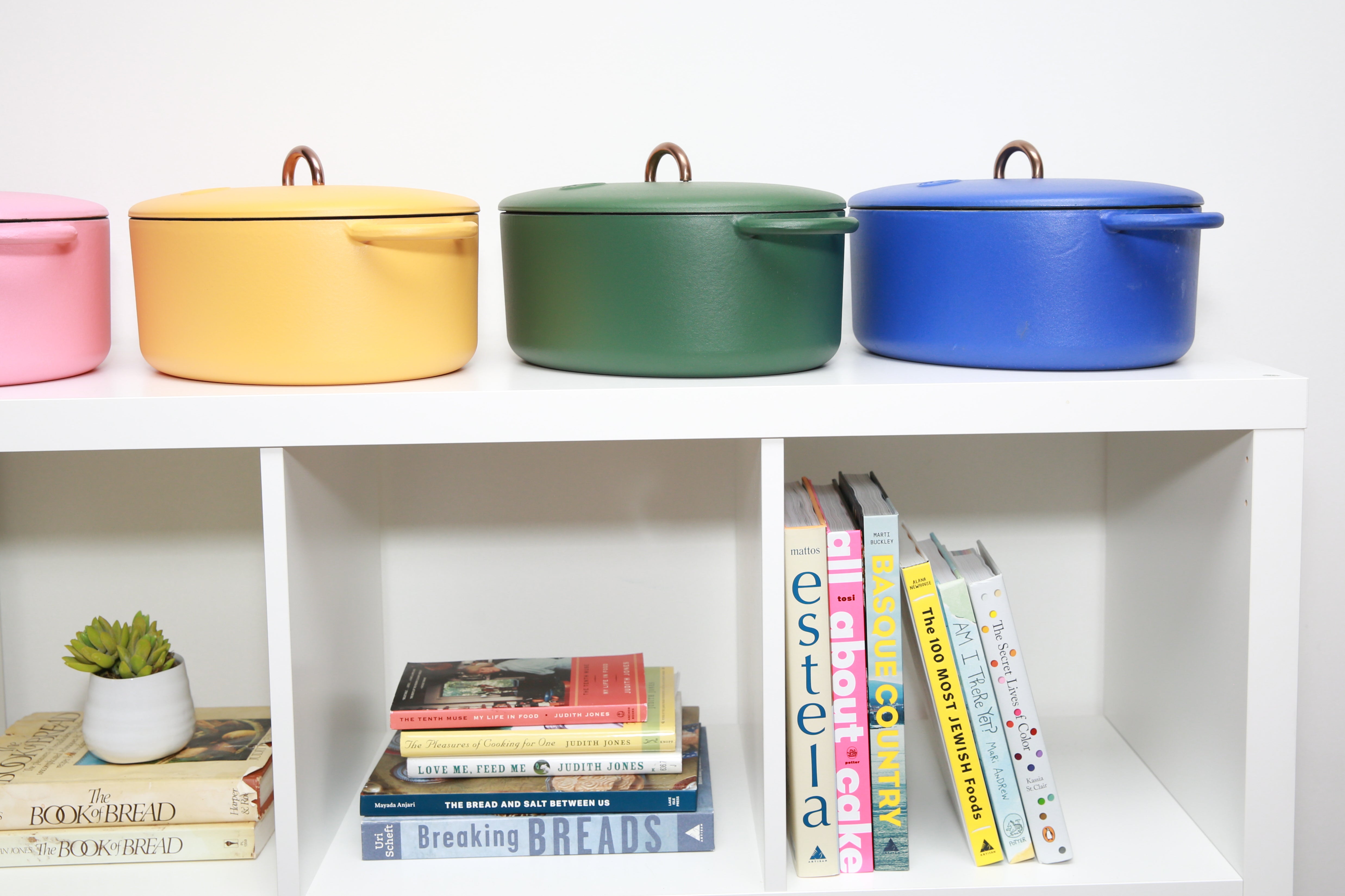
The Great Jones Dutchess, in an array of colors
Cooks of diverse cultural backgrounds look to these classic pieces of cast iron to make everything from shoyu chicken, as I do with my Flame-colored Le Creuset, to dosa, as Nik Sharma does with his matte black Staub. Still, it can be grating when brands refer to an assumed past you may not share. At the moment, most direct-to-consumer cookware brands are selling a specific form of nostalgia—which is to say, it’s still a white one. (One exception is Our Place, which released a Lunar New Year collection in collaboration with Chinese and Chinese-American artists in January.) Brands with Le Creuset or Staub in their DNA are continuing the great American tradition of Francophilia. At the same time, much of these new companies’ branding imports that Francophilia into a more undone ’60s and ’70s American dinner party context—Great Jones’s logo is modeled after New York typefaces of that era, and Tollefsen says Equal Parts referred to 1970s jazz album covers.
Author Andrea Nguyen’s cast iron skillet conjures memories of her mother cooking steak in their San Clemente, California, kitchen, in the 1970s and ’80s. “It’s an American thing, and yet I have these Franco-Vietnamese-American associations with it, because that’s how my family used it,” she reflects. Nguyen’s nostalgia for her mother’s cooking has influenced her kitchen must-haves, including multiple Chinese steamers, which “always need to be nearby.” Meanwhile, she says, “Those heavier pots like the Staub and enamel-coated cast iron are in my garage.”
Whether you grew up with pieces of cookware like these, or bought your first as an adult, like I did, it can be impossible to predict if your Staub will take up prized real estate on the stovetop or end up, like Nguyen’s, sitting in the garage. Klancy Miller, the author of Cooking Solo, has accrued a dynamic company of pots, pans, and waffle irons over the years, taking joy in the mismatch. “Nothing is consistent in my kitchen. It’s a total hodge-podge,” Miller laughs. “I’ve got Le Creuset, I’ve got Lodge, I have more than one stainless steel thing. I’m not really loyal to one particular brand, and I like free gifts.” Recently, she has newfound enthusiasm for the Great Jones Deep Cut pan, which she says cooks a killer rib eye and is easy to wash.
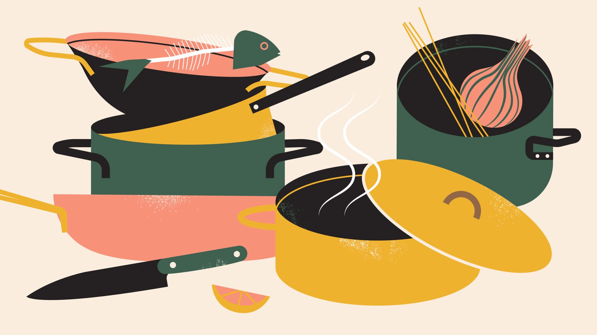
Though I’m trained as an architect and am married to one, I have little patience for kitchens that seem to have sprung from a catalog. I love scoping out the mismatched woks, cast irons of varying pedigree, casseroles with stubborn speckles, and corny mugs that fill other people’s kitchens. If a smooth French oven with a handle like a bangle bracelet finds its way in alongside the Le Creuset, I say welcome. However curated or haphazard, they tell stories of who we’ve been and who’s been with us along the way. Or, as Nguyen puts it, “They chart the course of my adult life.”